|
26 September 2009
When I came up with the title “BHOOT” everybody thought it was cheap and comical. But once they saw it along with the artwork on the poster the same people thought it was brilliant. I always felt a title combined with an artwork of a poster can communicate more about a film than even a full length trailer. That is because the title kind of encompasses the subject matter of the film in totality especially when it’s a single word and the poster design along with a tag line gives it the weightage and the genre clarity and also sometimes if there are one or two lines on the poster on what it’s about, it rouses tremendous interest to see the film first day first show.
My first ever conscious study of a movie poster was of Steven Spielberg’s “JAWS”. The poster shows a girl swimming naked and a shark with its jaws open vertically rising towards the girl. In small letters somewhere in a corner of the poster there were these words “She was the first”. The font size and the placement of the words “She was the first” were designed to almost make you feel that the makers are telling you in confidence a deadly secret and they don’t want the shark and the girl to hear it.
In the poster of Ridley Scott’s “ALIEN”, in a kind of take-off from Stanley Kubrick’s “2001 A Space Odyssey”, there is a highly surrealistic image of an egg seemingly in outer space and you kind of see the beginning of a crack in the shell of the egg. The tag line on the poster goes “In space no one can hear you scream”. This was done just to draw attention to the fact that sound needs a medium to travel and since outer space does not have that, suddenly there is a huge emphasis on the ultra loneliness of the crew of the space ship.
One poster which really caught my attention during those early days was one with the lines on it going like this…
“It came from a distant planet on a hunt.
It chose the wrong man to hunt”.
Arnold Schwarzenegger in
“PREDATOR”
On one hand by using the word “it” and a “distant planet” and “hunt”, the poster clearly gave the idea that the film is about an outer space creature and that it’s hostile. The 2nd line “It chose the wrong man to hunt” highlighted the super Action hero image “Schwarzenegger” was enjoying at that time.
An old Clint Eastwood film called “The High Plains Drifter” had this image of a man coming from a distance on a horse back in the suggestion of a peaceful looking town. The line on the poster was “Everything was quiet until the day he drifted into town” thereby preparing us for the action we can expect when he reaches town and that obviously we get to see if and only if we go to see the film. Also just check the high-drama in the simplistic sounding title “The High Plains Drifter”. It tells us so much about the character without telling a thing. “Who is he? Why does he keep drifting? What is it about him and the high plains? What is he looking for? Why does he create trouble wherever he goes?” are the multiple questions which come rapidly into your mind thereby building your curiosity that much more to want to see the film.
Another poster which probably had the most intense emotional condensation I have ever seen ever in a movie poster is of a movie called “Death Rides a Horse”. The poster shows a man riding away through a hangman’s noose and the line on the poster goes “After waiting for 20 years it’s a shame that you can kill him only once”.
The sheer drama what this one line told me about the film is about, almost gave me goose flesh at that time. How much would the protagonist be hating the antagonist to continue his quest for revenge for 20 years and what could the antagonist have done to the protagonist for him to seek such terrible revenge?
The poster for James Cameroon’s “ABYSS” had a line proclaiming “After everything you have ever seen of high adventure there’s ‘ABYSS’.
The sheer pride and the confidence with which the makers proclaim that makes you feel intimidated by the film even before you enter the theater.
Coming to our dear desi bollywoodies the concept of movie posters as an art form was and is almost non-existent. That’s because the emphasis here is always on “Who is in the film?” rather than “What is it about?” They will just put all the faces of the actors whoever big or small is in it. That’s mostly because the bollywoodies work in an extreme fear psychosis, that the audience won’t come into the theatre whereas Hollywood works on a pride and confidence and is almost teasing the audience.
The posters of the sexual harassment film “DISCLOSURE” with big stars like Michael Douglas and Demi Moore just had a woman sitting in the lap of a man and you can’t see the faces of the actors. It’s just written “starring Michael Douglas and Demi Moore”. Just imagine a bollywoodie putting a poster with no faces on it, if there are big stars in his film.
The tragedy of us bollywoodies is that 90% of them promote everything about the film except the content, and that is especially true of our posters.
Anyway leaving bollywood aside and coming back to the wonderful art of movie posters the greatest example of how a poster can make a great huge opening weekend possible is that of “Blair Witch Project”. The low budget film “Blair Witch Project” released along with the Tom Cruise, Nicole Kidman starrer “Eyes Wide Shut” directed by Stanley Kubrick.
“Blair Witch Project” starring nobodies and directed by a nobody, opened far better than “Eyes Wide Shut” taking the entire lot of Hollywoodies by surprise, thanks to just one poster design as the makers did not do any other publicity in terms of promos, theatrical trailers etc for lack of money.
The poster just shows the close-up of very scared girl looking into a camera seemingly held by her own hand with extreme fear in her eyes. This image coupled with the lines on the poster “Four students went into the woods near maryland to do a documentary on the legend of the Blair witch… Months later their footage was found”. This amazing work of art got the cash registers ringing and how!
The strongest statement ever a movie poster has made on me is of the Oliver Stone written Milas Foreman film “People VS Larry Flynt” based on the real life story of Larry Flynt the pornographer. The film’s poster has a close-up of a woman’s crotch and Woody Harrelson playing the protagonist poses in the classic crucified Jesus pose against the woman’s vagina in the shape of her panties. This artwork of the films poster basically sums up the point of the film that it is religion which acts as a spoil sport in matters of sexual pleasure. This poster I think is one of the greatest pieces of art I have ever seen for its sheer imaginative brilliance and the stunning philosophical statement it makes. I rate the designer of this poster as a far greater artiste than Michelangelo, Van Gogh, M.F.Hussain etc.
P.S: Before you guys jump up on me for making that last sacrilegious statement let me tell you that I prefer Himesh Reshamiya to Mozart and strip-tease dancing to Bharatnatyam. For me art is about what I, Me and Myself feel good about.
I wouldn’t want an M.F.Hussain painting for free but I would pay anything to have a blow up of the People v/s Larry Flynt poster on my wall.
I am posting some of my favourite movie poster arts in here.
Please remember that these posters taken from the net did not necessarily appear in the same way as when those films released. Over the years in subsequent releases they kept on changing. My comments in the article were on the very original posters such as how I saw them in the theaters.

Bhoot poster 1

Bhoot poster 2
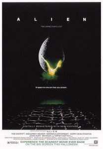
Alien
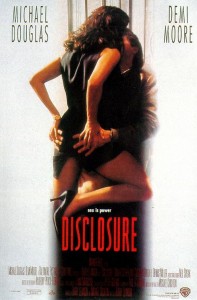
Disclosure
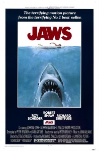
Jaws
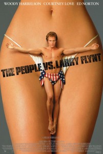
The people vs Larry Flynt

Phoonk poster 1
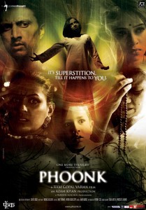
Phoonk poster 2
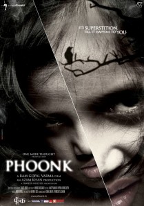
Phoonk poster 3
Other articles by Ram Gopal Varma:
My reaction to reactions (25 Sep 2009)
A fighter's mind (20 Sep 2009)
My reaction to reactions (16 Sep 2009)
The Inbetweenists (12 Sep 2009)
My reaction to reactions (12 Sep 2009)
My reaction to reactions (1 Sep 2009)
a SILENT shout
My reaction to reactions (22 Aug 2009)
The Obama Effect
My reaction to reactions (19 Aug 2009)
Programme F**k ups
My reaction to reactions (16 Aug 2009)
My reaction to reactions (12 Aug 2009)
The real HoRROR (about Agyaat reviewers)
Lock-up lessons
My reaction to reactions
The Psychological aspect of BGM
Note: Thanks to Ram Gopal Varma for giving us special permission to republish his blogs in idlebrain.com (visit rgvzoomin.com to visit Ram Gopal Varma's blog) |

